Five suppliers, five colour matches: managing print across every location
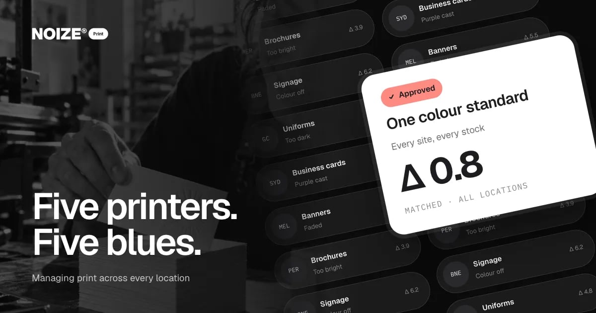
The signage in Brisbane is a slightly different blue from the uniforms on the Gold Coast. The business cards in Sydney have a purple cast. The banners in Melbourne have faded. The brochures from the newest supplier are noticeably brighter. Each job was approved. Each supplier did what they thought was right. Together, they make one brand look like five.
Colour drift is one of the most common and most fixable problems in print. It happens whenever a brand is produced by several suppliers, on several materials, across several locations, without one standard holding it together.
The short version
Colour changes between processes, materials and suppliers, so brands printed by many hands drift. One print partner using a single colour standard, master files, material-specific proofs and managed reorders keeps the brand consistent everywhere, and multi-site businesses spend far less time chasing suppliers.
The short version
Colour changes between printing processes, materials and suppliers, so a brand printed by many hands drifts. One print partner working from a single colour standard, proofing on each material and managing reorders from the same files keeps the brand consistent everywhere. For multi-site businesses that means every location looks like the same company, and far less time is spent chasing suppliers.
Why colour drifts
01Different processes
Digital print, offset, screen printing, embroidery, vinyl and large-format inkjet all reproduce colour differently. The same file can produce visibly different results.
02Different materials
Coated card, uncoated paper, fabric, acrylic, metal and vinyl absorb and reflect colour in their own ways. A colour that looks right on gloss can look dull on uncoated stock.
03Different suppliers
Each printer calibrates their equipment differently and interprets files their own way. Without a shared standard, each one is right by their own measure.
04Different files
Old logo files, screen colours sent for print, and artwork recreated by suppliers all introduce variation before printing even starts.
> I've managed brands across multiple locations, and the colour problem always looked small until we lined everything up on one table. Customers who visited two sites noticed before we did. One standard and one partner fixed in months what years of individual jobs couldn't.
What one colour standard looks like
- Defined values for every process. The brand colours are specified for screen, print, specialist inks, thread and vinyl, so each process has a target.
- Master files. One set of correctly prepared artwork files that every job uses.
- Material-specific proofs. New jobs are proofed on the actual stock or material and checked against the standard before production.
- Measured tolerance. Colour is checked against an agreed tolerance rather than judged by eye alone.
- Managed reorders. Repeat jobs come from the same files and specifications, so the hundredth run matches the first.
Why multi-site businesses benefit most
Franchises, groups and businesses with several locations feel colour drift most, because each site often uses a local supplier. One print partner managing every location means a customer who visits Brisbane and Sydney sees the same brand in both. It also simplifies ordering: one process, one point of contact, consistent pricing and delivery tracked in one place.
“Exceeded our expectations in terms of quality, design and timeframe.”
An illustrative example
Imagine a real estate group with offices in four cities, each ordering signboards, cards and window displays locally. Lined up together, there are four versions of the brand colour. Moving every location to one print partner, with a defined colour standard and master files, brings them back into line within a few orders. Agents order through one process, and the group finally looks like one business.
Where Print fits with Creative
When artwork needs designing or fixing, NOIZE Creative prepares it properly for print. When the brand changes, Creative updates the master files and Print rolls them out. The two departments keep the standard in step, so consistency isn't lost every time the brand evolves.
Where to start this week
Collect one of every printed item from each location and lay them out under the same light. Photograph the line-up. If you can see more than one version of your colours, a colour standard will pay for itself in reprints avoided. See print.noize.com.au.
What colour consistency is worth
Consistent colour is one of the strongest brand signals there is. When customers see the same colour on the shopfront, the uniform, the van and the website, recognition builds quickly. When they see five versions, the brand looks less established and less trustworthy.
There is a practical saving too. Colour problems cause reprints, delays and arguments with suppliers. A defined standard settles those arguments before they start, because every job is measured against the same target.
The role of proofs
Proofs are the cheapest insurance in print. A digital proof checks content and layout. A physical proof on the actual material checks colour and finish. For important or large runs, especially on new materials, a physical proof avoids expensive surprises. NOIZE Print builds proofing into the process, so approval happens on something close to the final result.
Keeping the standard as the brand evolves
Brands change over time. When they do, the master files and colour standard need updating everywhere at once. Creative updates the files, Print updates the specifications and every location moves together, rather than drifting again one supplier at a time.
Questions to ask before you start
Ask how many suppliers produce your printed material. Ask whether colours are specified for every process. Ask where the master artwork files live. Ask how proofs are approved. Ask who checks reorders against the standard. The answers show where colour drift starts.
Related reading
- Why print still works when everything else is digital
- Packaging is the first time a customer touches your brand
Common questions
Why don't my print colours match between suppliers?
Different processes, materials and equipment reproduce colour differently. A shared colour standard and proofing on each material keep them aligned.
What is print management?
Managing every print job across suppliers, materials and locations through one partner, with consistent standards, proofs and reorders.
Can you manage print for multiple locations?
Yes. Multi-site print management is one of the main reasons businesses use NOIZE Print.
Do I need new artwork files?
Often a set of correctly prepared master files is the first step. Creative can prepare them.
Will one print partner cost more?
Usually it costs less overall, through fewer reprints, consolidated orders and less time spent managing suppliers.
What is a colour proof?
A sample printed on the actual material, or as close to it as possible, so colour and finish can be approved before the full run.
What are Pantone colours?
A standardised colour system used in printing. Specifying Pantone references, alongside print and screen values, helps suppliers match brand colours consistently.
Why does the same colour look different on fabric and paper?
Materials absorb ink and reflect light differently. Each material needs its own colour specification and a proof to confirm the match.
How do we keep reorders consistent?
Use the same master files, specifications and supplier, and check each run against the approved proof or colour standard.
Your first strategy conversation is on us.
Have a chatThe brand for business.